
While Shure has earned a reputation for innovative product design beginning in the 1930s, one of the most enduring components in those designs has been the Shure logo.
The first logomark for Shure products was introduced in the mid-1930s and continues to appear on products more than 60 years later. The design, created by an employee, is based on a schematic diagram of a radio circuit. On the left side of the mark, wavy lines represent radio waves or sound waves. In the center, the “S” shape has two meanings: it is the symbol for an AC generator, and it stands for Shure. On the right of the mark is a shape indicating that the generator is wired to the resistance (or load) of the circuit. When viewed as an electronic story, the mark shows sound waves being converted into a fluctuating electrical current or how an electrical current can be applied to a transmitter to make radio waves.
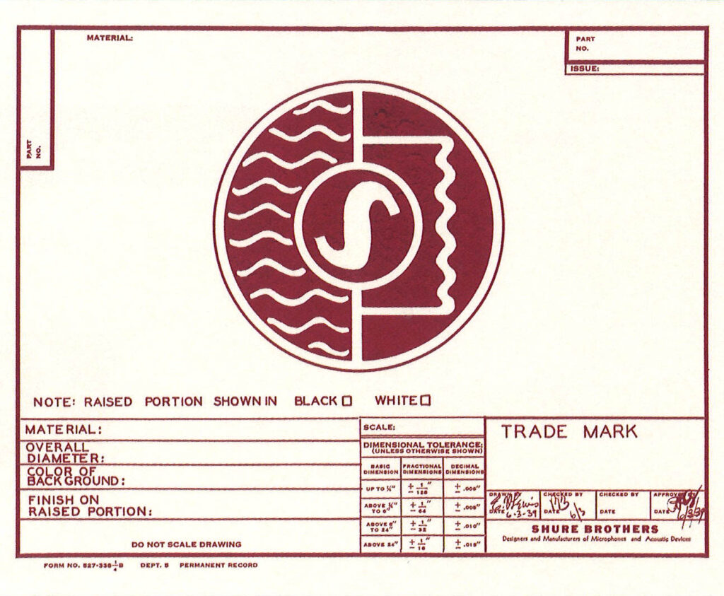
In describing the logo in 1943, Vic Machin, then a Technical Sales Correspondent, wrote: “We see it every morning on that impressive new sign over the entrance (to the Shure plant in downtown Chicago). We see it on our T-17 Microphones, on our letterhead, and on practically every piece of our printed literature.…It proudly symbolizes the products we make and their relation to the very broad field of electronics. They are the vital link in an almost daily achievement, where the human voice can be hurled around the world at a speed of 186,000 miles per second and where the drop of a pin can be made to sound like the crash of thunder.”
In the 1950s, another logo was developed for the Company. This modern typographic logo emphasized the name “Shure” and eliminated the diagrammatic elements of the original mark. For many years, Shure used both the original logo and the later version. The “S” logo was applied to product decals, mailing labels, and stationery. The newer logo was used in catalogs and Company advertising.
In 1982, after 25 years, the logo was redesigned again. Its bold characters and contemporary styling reflected a new focus for the Company. The logo symbolized the new, more aggressive position Shure was taking, both nationally and internationally.
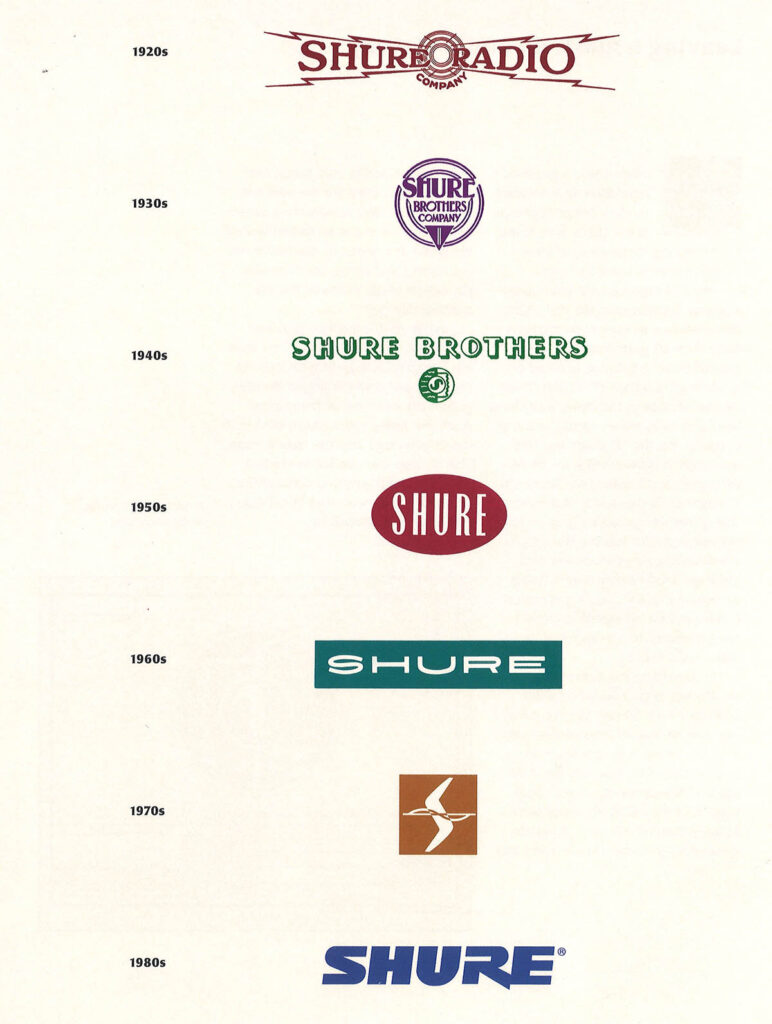
In 1999, the logo was modified as part of a branding campaign focused on reaching younger customers who were less aware of major audio industry brands, including the Shure brand. The letterforms of the logo built on the 1982 version, but a three-dimensional effect made the logo more contemporary and conveyed Shure’s expanding capabilities and product line.
“The redesigned logo builds on a mark that Shure had established over the past 18 years, while projecting our leadership position in many areas of the audio industry,” commented President Sandy LaMantia. “The logo is well known and respected in professional markets; and as we expand our position in the consumer arena, I am confident that this logo will give us the presence we want to achieve.”

Although this latest logo is used on products, packaging, advertising, apparel, and its web site, Shure’s first logo—the “S” mark—continues to play a prominent role. The mark appears on KSM Studio Microphones, first introduced in 1998, and is used in a variety of promotional materials, from coffee
cups to jackets.
The ‘S’ mark is a classic,” declared Tim Vear, Senior Applications Engineer. “It was progressive when it was introduced; and although it’s nearly 70 years old, it does not look dated. In our 2000 catalog, you can find the mark on our oldest microphone still in production, the 55SH Series II Microphone, and one of our newest products, the KSM32. That shows it has an enduring quality.”
